

Phil Holcombe is Form & Faculty's founder and Chief Design Officer, bringing decades of experience designing educational products and curricula, alongside 10+ years of teaching in K–12 and higher education.
Imagine you’re researching schools for your child. You’re scrolling through websites — most of them cluttered, confusing, and indistinguishable. They rarely communicate what the school believes or what makes it special. You don’t need examples; you’ve seen these sites, and you’ve probably worked in a school where this was the norm.
But then you land on one that stops you in your tracks.
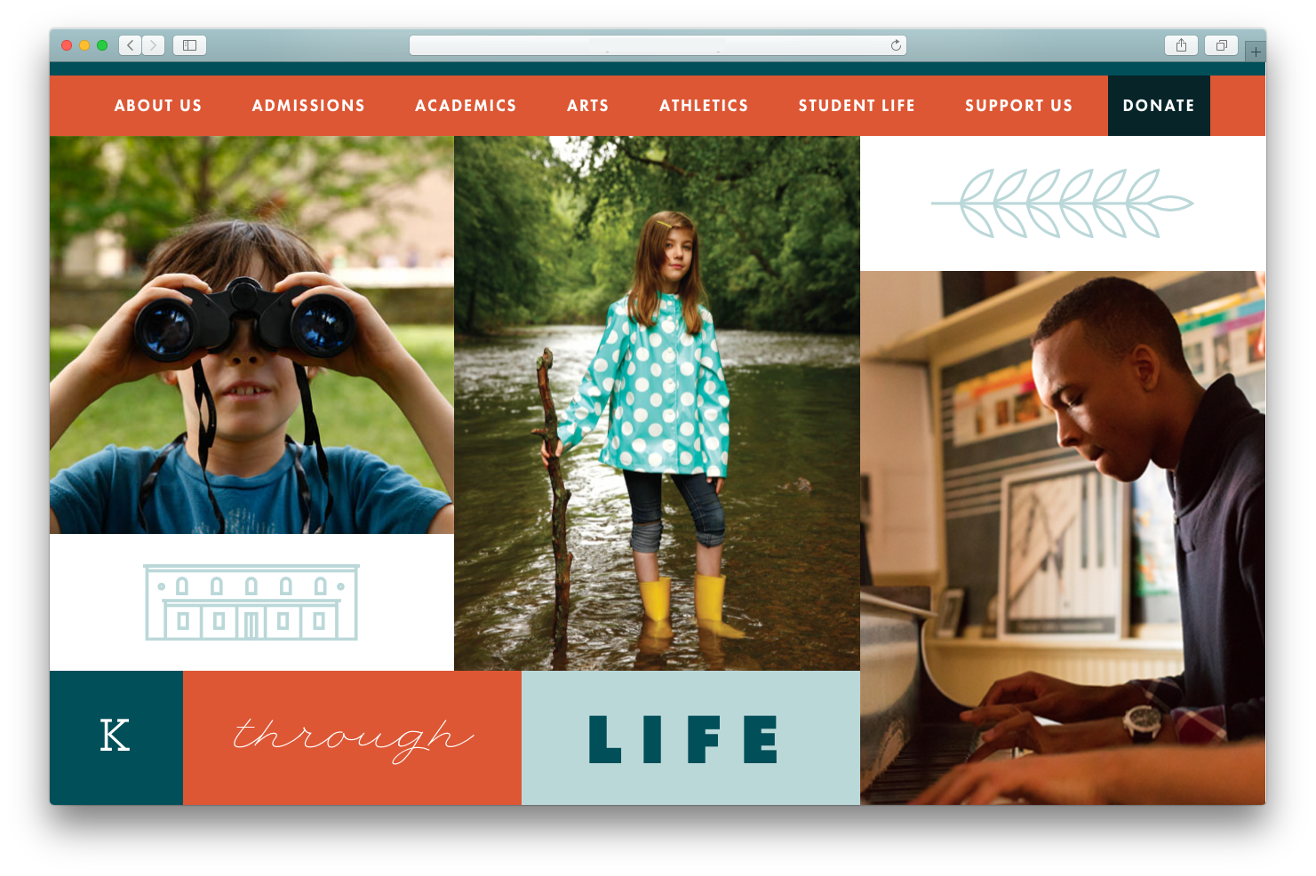
Suddenly, you’re paying attention. This school speaks clearly and confidently. You notice the young woman standing in the stream—an unexpected, arresting moment in a collage of faces—and you feel something. She seems empowered. She owns her learning. She’s stepping into the world with purpose. In a single glance, you understand what this school values. There’s a blend of logic and magic at play, and as a result, the school stands out.
For years, I’ve helped schools articulate who they are. I’ve crafted missions and visions, designed websites, directed photo shoots, and produced viewbooks and fundraising materials. The stories that resonate aren’t the ones that list competitive advantages — they’re the ones that ignite passion.
When a school can’t show what makes it unique, it loses prospective students, teachers, and leaders.
And showing what makes you unique isn’t just about strong copy. Missions and visions must live in your visual identity — the graphic, photographic, and typographic choices you make. Great schools make these decisions deliberately because they know that stories gain power when told consistently, across every touchpoint.
A quick aside:
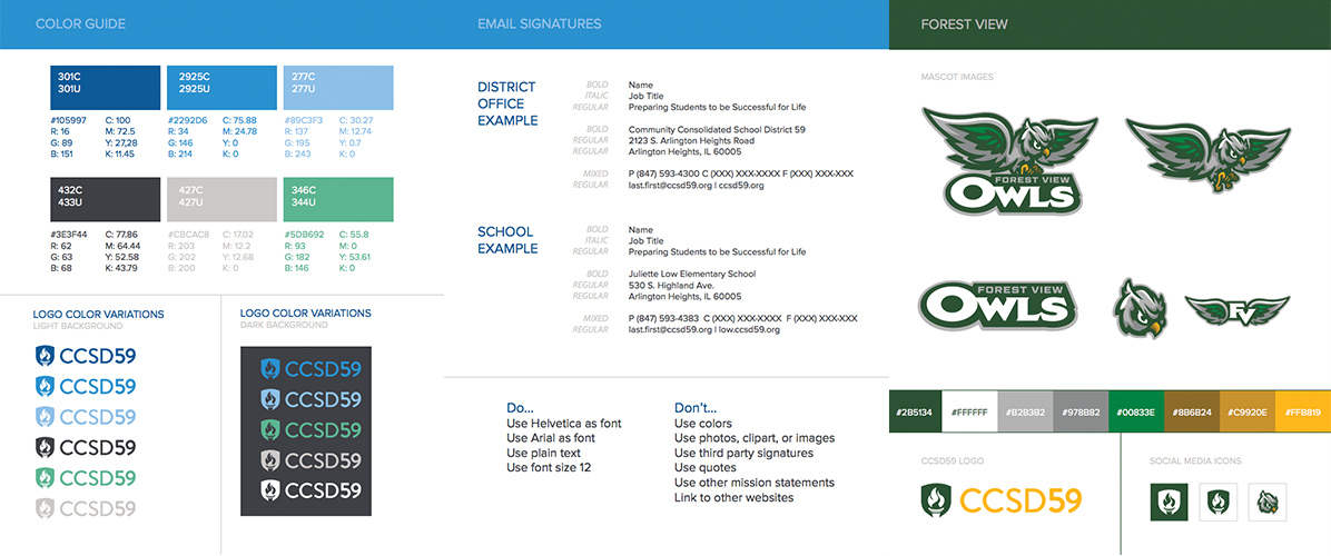
This level of storytelling has traditionally been the domain of independent schools, charters, colleges, and universities. But public schools benefit just as much when they invest in narrative clarity. Community Consolidated School District 59 outside Chicago is a great example. Their brand guidelines aren’t decorative; they shape communication across the entire district.
Every school needs to consider the story it tells. Unique stories attract the families, teachers, and administrators who make a community thrive. That’s not a luxury—it's an investment.
Standing out takes courage. It takes clarity about what makes your school distinctive. And for many schools, it takes a willingness to rethink the usual way of doing things. “We’ve always done it this way” is a mindset that guarantees invisibility.
We don’t notice when things are the same, we notice when things are different. We’re hardwired that way.

It takes courage to be the purple dot. It takes hard work and self-awareness to understand what makes your school stand out. And for many, it requires a willingness to shift priorities. “We’ve always done it this other way” is a mindset that usually ensures you’ll remain invisible.
And invisibility is a risk. Most schools today blend into the background. They’re Waldo Schools.

It sounds dramatic, but the schools that remain indistinguishable risk their futures. Thought leader Grant Lichtman and Edward E. Ford Foundation Executive Director John Gulla argue that in 25 years, every school will fall into one of three categories:
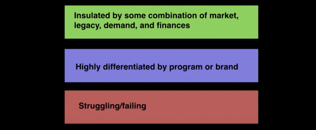
Of course, every school wants to live in the green zone. But the reality is that many will need to operate in the purple one if they hope to avoid sliding into the struggling or failing categories. To thrive, schools must do more than define what makes them unique—they need to make us see and feel it through compelling storytelling and thoughtful design.
So what does true differentiation look like?
It starts with clarity. A school must know what truly sets it apart. Be cautious about building an identity around things like student–teacher ratios, high graduation rates, or experienced faculty—those may be strengths, but they’re not differentiators when everyone has them.
In our work with the MDes in Product Design program at The University of the Arts, we facilitated visioning sessions to identify a new focus for the program. We discussed Philadelphia’s industrial history and its former title of “Workshop of the World”. We talked about the plethora of manufacturers in the city and the struggles they experience as manufacturing shifts to our desktops and product shifts to our screens. We observed that the knowledge required to design a product and the knowledge required to manufacture it are becoming increasingly unwound from each other, and the result was detrimental for everyone: the designer, the manufacturer, the consumer, and the planet.
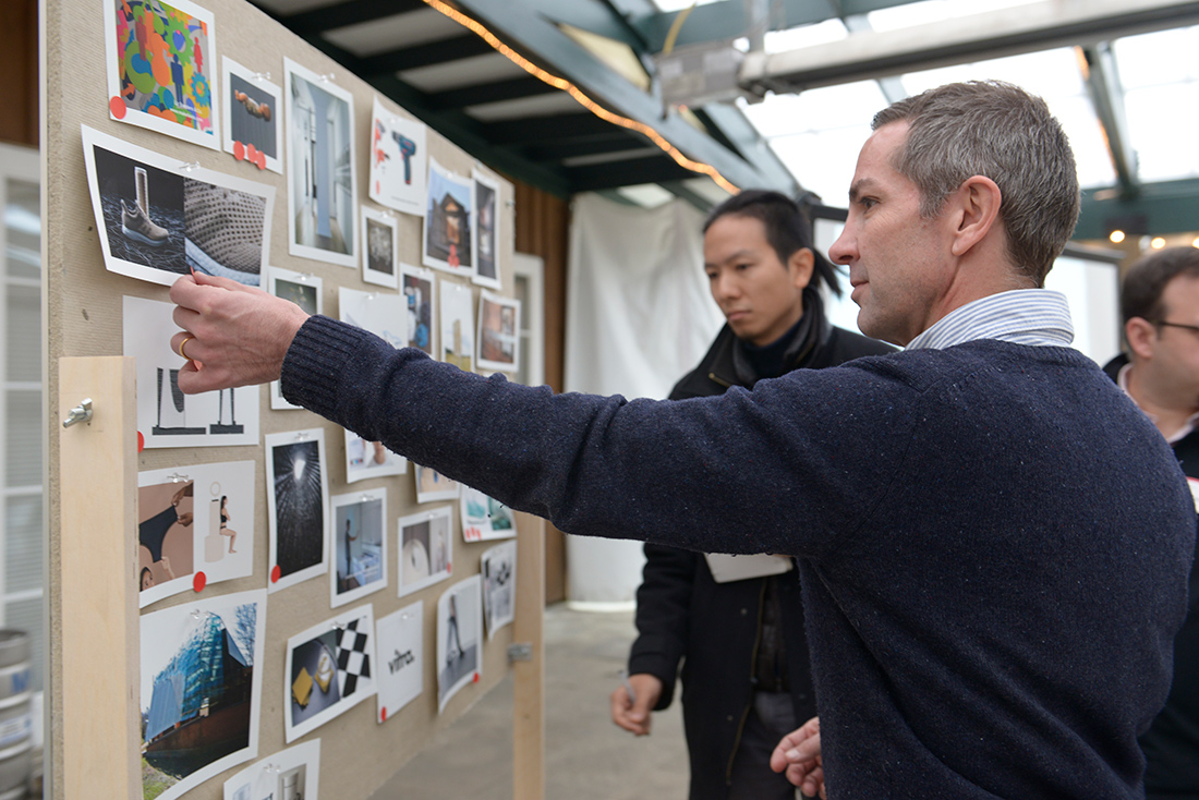
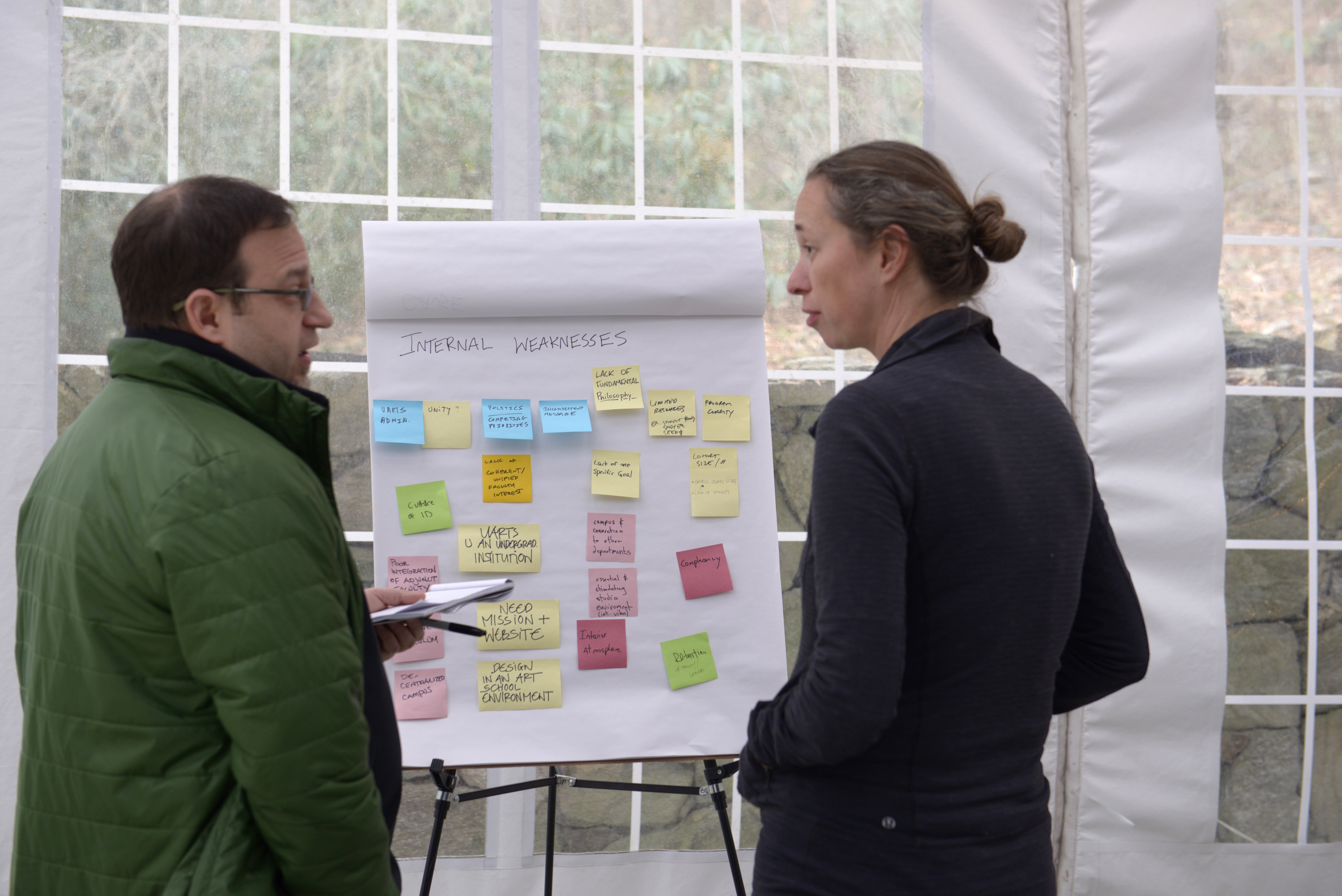
We established a commitment to mending the unraveling narratives of designing and making, and retooling relationships between designers, suppliers, manufacturers, and consumers. We committed to establishing mutually beneficial partnerships with local manufacturers to produce innovative products that reflect a deeper understanding of the ties between designing and making. This vision is one where students will be fully prepared to enter industry, and Philadelphia manufacturers will be empowered with new purpose and profitability.
With something unique to offer, we needed people to be as passionate about the program as we were. So we began creating a visual identity to help express these ideas. Built upon the visual logic of manufacturing, the logo animates in a way that’s reminiscent of automated machinery. The simple, strong typography is no-nonsense, and modeled off of the 1900s American vernacular lettering and signage found in urban environments.
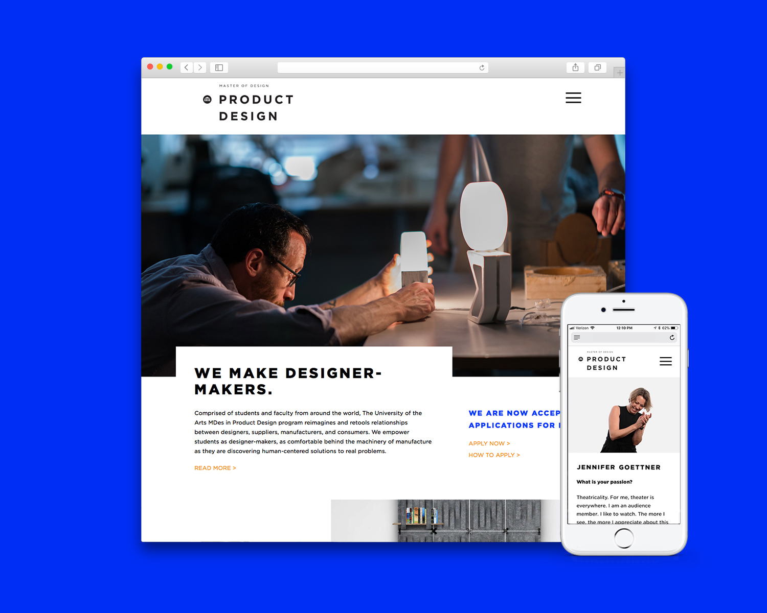
This aesthetic filters into their web and print presences as well. Bold typography, plainspoken language, and a minimal color palette emphasize practicality and function. We improved faculty bios through photography and interviews, which included questions like “What is good design?”, “What are your passions?”, and “Where is the field of product design headed?” We curated case studies of student work, and placed an emphasis on their process. We built the site on a robust content management system so that students and faculty can quickly add and edit their own content. Perhaps most importantly, we placed their new vision at the top of the home page, and linked to a dedicated “Vision” page.
Did it work?
Yes.
Applications nearly doubled the next cycle. The cohort grew and became more selective. Faculty refined the curriculum with a clearer sense of direction, and students could engage in those conversations because they understood the program’s purpose.
If you’re trying to differentiate — or you’re worried you might be a Waldo School — here are some questions worth asking: